By Terence Dick, Art Critic
In contemporary visual culture, graphic design is often asked to perform two functions at once: to communicate with speed, and to hold emotional complexity without reducing it. The work of Chinese visual artist and graphic designer Yuan Sang stands out precisely because it resists the flatness of purely commercial communication. Across poster design, visual identity, narrative photography and digital exhibition formats, Sang has developed a visual language that treats design not only as a tool of information, but as a critical method for examining psychological pressure, sensory accessibility, gendered experience and emotional self-recognition.
Sang's recent body of work demonstrates a designer moving beyond surface aesthetics into a more reflective field of visual inquiry. His projects are not merely well-composed images; they are structured visual arguments. They ask how young people experience pressure in a productivity-driven society, how sound may be translated for those who cannot access it through hearing, how women confront social labeling and self-protection, and how emotional states can be transformed into participatory visual experiences. This breadth gives his practice a distinctive position within contemporary visual communication: it is socially conscious, formally experimental and culturally responsive.
One of the strongest examples of Sang's critical approach is The Weight of Pressure, a poster series addressing the psychological burden placed on young people by education, work and financial expectations. The series uses symbolic elements including the human heart, computers, artificial intelligence and digital files to suggest the gradual absorption of human emotion into mechanical routines. What is striking in this work is the tension between its vivid visual energy and its darker conceptual core. Bright colour, bold composition and internet-inflected irony are not used for decoration alone; they become a means of exposing the contradiction between youth vitality and social exhaustion.
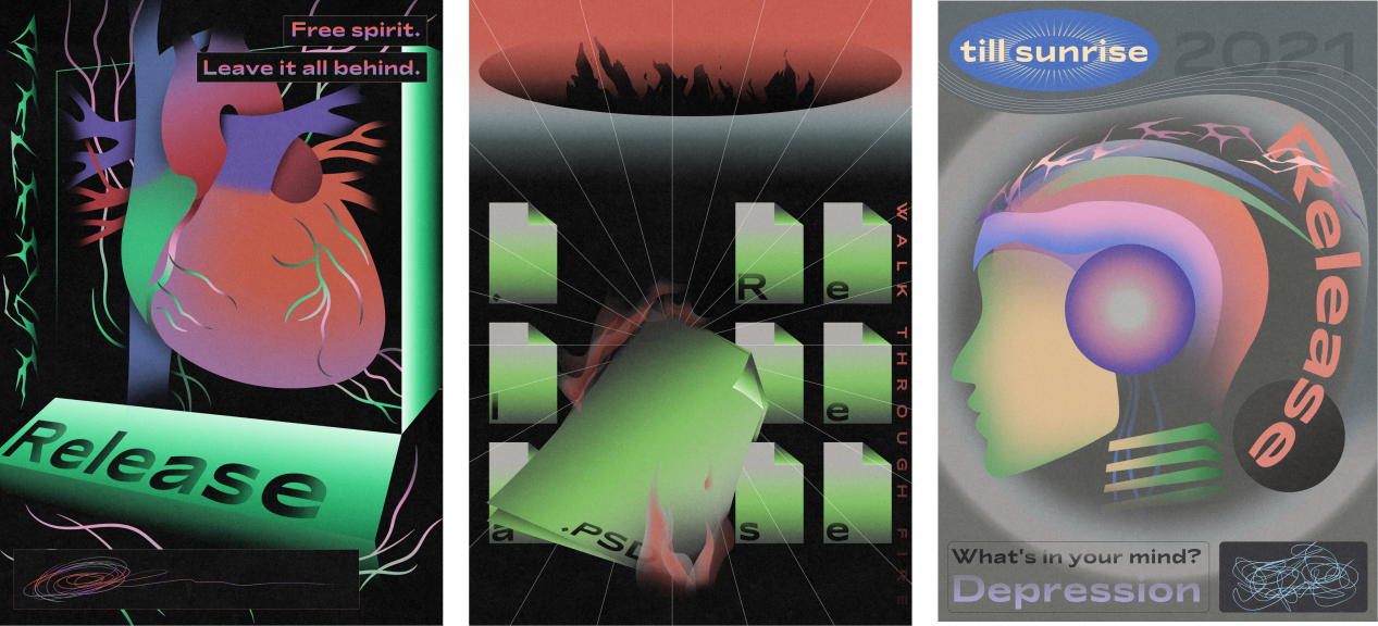
(The Weight of Pressure, designed by Yuan Sang)
The quality of Sang's design lies in his ability to make this contradiction legible. The posters operate on several levels. At first glance, they attract attention through high-contrast colour and dynamic graphic rhythm. On closer reading, however, the viewer begins to see how the human body is placed under pressure by systems of productivity, digital repetition and social expectation. The work is effective because it avoids literal illustration. Instead, it builds a visual metaphor in which organs, screens, files and artificial intelligence symbols form a compressed landscape of anxiety. In this sense, Sang's poster practice recalls the strongest traditions of socially engaged graphic design: accessible in visual impact, but layered in interpretation.
A related concern with accessibility and perception appears in “EYES ON: Visualising Sound”, a project that explores how music can be experienced visually. Inspired by synaesthesia and artists such as Christine Sun Kim, Sang translates sound into waves, geometric forms, colour shifts, kinetic elements and typographic rhythm. The project proposes that music need not be limited to auditory reception; it can be felt, read and seen through a carefully constructed visual system.
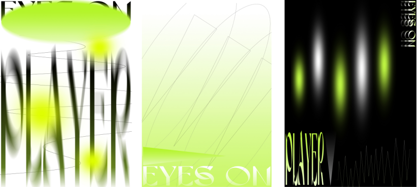
(EYES ON: Visualising Sound, designed by Yuan Sang)
This is one of Sang's most conceptually mature works. The project's logo, combining an eye and a play button, is simple but effective: it immediately communicates the idea of “seeing music.” More importantly, the visual identity does not treat accessibility as an afterthought. Instead, accessibility becomes the conceptual foundation of the work. Chartreuse tones, analogous colour relationships, motion-based structures and rhythm-sensitive typography create an experience that is playful without becoming superficial. The result is a design system that expands sensory participation and demonstrates how graphic design can intervene meaningfully in conversations about inclusion.
Sang's practice also shows a significant engagement with gender, identity and selfhood. Metamorphosis: Female Youth and Self-Protection uses narrative photography to depict a young woman's psychological journey through four emotional stages: Reflection, Confinement, Anger and Rebirth. The project addresses the social risks and stereotypes faced by young women, while asserting the importance of empowerment and personal agency.
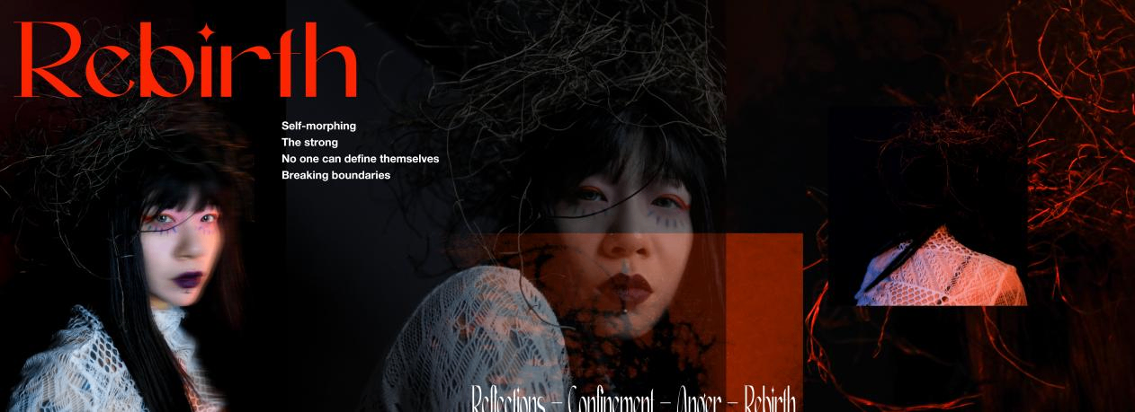
(Metamorphosis: Female Youth and Self-Protection, designed by Yuan Sang)
What makes this series compelling is its carefully staged emotional progression. Makeup, styling, props, pose and post-production are not treated as isolated visual devices; they work together to create a narrative of inner transformation. The female figure in the work is at once composed and constrained, elegant and restless, vulnerable and defiant. This duality gives the series its emotional force. Sang does not present empowerment as a simple slogan. He shows it as a process: first internal struggle, then restriction, then confrontation, and finally the possibility of self-redefinition. The imagery is cinematic in tone, but its structure remains distinctly graphic, relying on contrast, layering, atmosphere and symbolic framing.
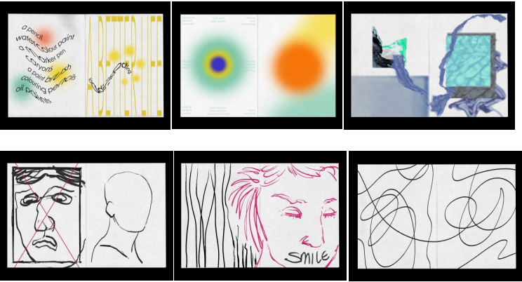
(The Moods, designed by Yuan Sang)
In The Moods, Sang turns toward emotional journaling and mental health awareness. The project combines graphic design, illustration, meditative painting practices and participatory creation, inviting viewers and other artists to visualise emotional states such as anxiety, relaxation and hope. This project is important because it broadens the role of the designer from author to facilitator. Sang creates a visual framework in which emotion can be interpreted and extended by others. The work therefore becomes not only a set of images, but a space for shared emotional processing.
From a critical perspective, The Moods is especially valuable because it recognises that visual communication is not limited to delivering fixed messages. It can also open a field of response. The project's use of soft gradients, symbolic objects, illustrative forms and collaborative interventions creates a visual environment that feels intimate yet publicly communicable. In an age when mental health discourse is often reduced to slogans, Sang's work offers a more nuanced approach: it gives emotional ambiguity a visual form without simplifying it.
Sang's artistic practice is strengthened by his professional experience in high-level visual communication. His commercial work includes art direction and visual strategy for international brand communication projects, including projects connected to BMW, MINI, Rolls-Royce, AIIB and M&M'S × Disney. This background is visible in the discipline of his personal works. He understands how to build coherent visual systems, maintain tonal consistency and translate abstract ideas into structured visual experiences. Yet his strongest works are not dependent on brand prestige. Rather, they show how the precision learned in professional design can be redirected toward cultural and emotional questions.
This combination of commercial fluency and independent artistic concern gives Sang's work international relevance. His practice sits at the intersection of graphic design, digital culture, visual art and social reflection. He is part of a generation of designers who no longer see visual communication as separate from public discourse. For Sang, design becomes a way to ask urgent questions: What happens to the individual under social pressure? How can visual systems support sensory inclusion? How can images help young women articulate resistance? How can emotional states be made visible without being over-explained?
The answer, in Sang's work, is not found in one signature style, but in a consistent method. He builds symbolic systems. He uses colour as psychological atmosphere. He treats typography and motion as emotional indicators. He combines photographic material with graphic structure. He is attentive to social context, but avoids didacticism. His best projects invite viewers to feel before they interpret, and then to return to the image with a deeper awareness of its conceptual architecture.
Yuan Sang's work deserves attention because it demonstrates the expanding role of visual design in contemporary culture. His projects are formally confident, intellectually grounded and emotionally accessible. They show a designer capable of moving between artistic experimentation and professional visual strategy, while maintaining a clear commitment to social and sensory experience. In a field often dominated by speed, novelty and surface effect, Sang's practice offers something more substantial: a visual language for the pressures, vulnerabilities and transformations of modern life.


Collaboratively administrate empowered markets via plug-and-play networks. Dynamically procrastinate B2C users after installed base benefits. Dramatically visualize customer directed convergence without
Collaboratively administrate empowered markets via plug-and-play networks. Dynamically procrastinate B2C users after installed base benefits. Dramatically visualize customer directed convergence without revolutionary ROI.


Global Insight Nexus (GIN) is a forward-thinking news platform dedicated to connecting the world with insightful perspectives. Through comprehensive reporting, in-depth analysis, and global coverage, GIN empowers readers with knowledge to navigate the complexities of our ever-changing world.